OAKLAND MARATHON BRAND
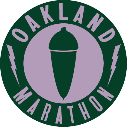
In 2024 the Oakland Marathon introduced its new logo, creating a brand to usher in a new era for the event.

An Icon
Designed by: Kalt Tropics
Typeface: Bayard by Tré Seals
Run Local commissioned Oakland-based creative agency, Kalt Tropics, to create an iconic brand for the Oakland Marathon. A brand that takes inspiration from the resilience of the California Live Oak and the energy that its Acorn has provided indigenous residents for millennia.
The new Oakland Marathon brand was deliberately designed to celebrate the Acorn that you can see and touch in Oakland. And feel the history and the electricity that will power us all to new heights individually and collectively.
The typeface, Bayard, was developed by Tré Seals, an innovative designer, inspired by the signs from the 1963 March On Washington For Jobs and Freedom.
Community Energy
The Coastal Live Oak, which produces the acorn represented in our logo has historically produces one of the original superfoods, a place of shelter, gathering and more to California Indigenous populations and all those who have come to enjoy them to this day.
The lightening bolt in our logo is a symbol of this energy and rejuvenation that the Coastal Live Oak has provided for generations of Californians.
It is with this spirit that we build the Oakland Marathon as a place for everyone in the community. To be one of the most diverse and inclusive events in the world. A place for people to gather and harness the positive energy of thousands of people moving together to reach their goals.
Resources
- TreSeals.com
- A Brief History and Guide to California’s Native Oaks – OurCityForest.org
- The Acorn: An Ohlone Love Story – OutsideInRadio.org
- Acorns & Native American Culture – VisitCalifornia.com
